
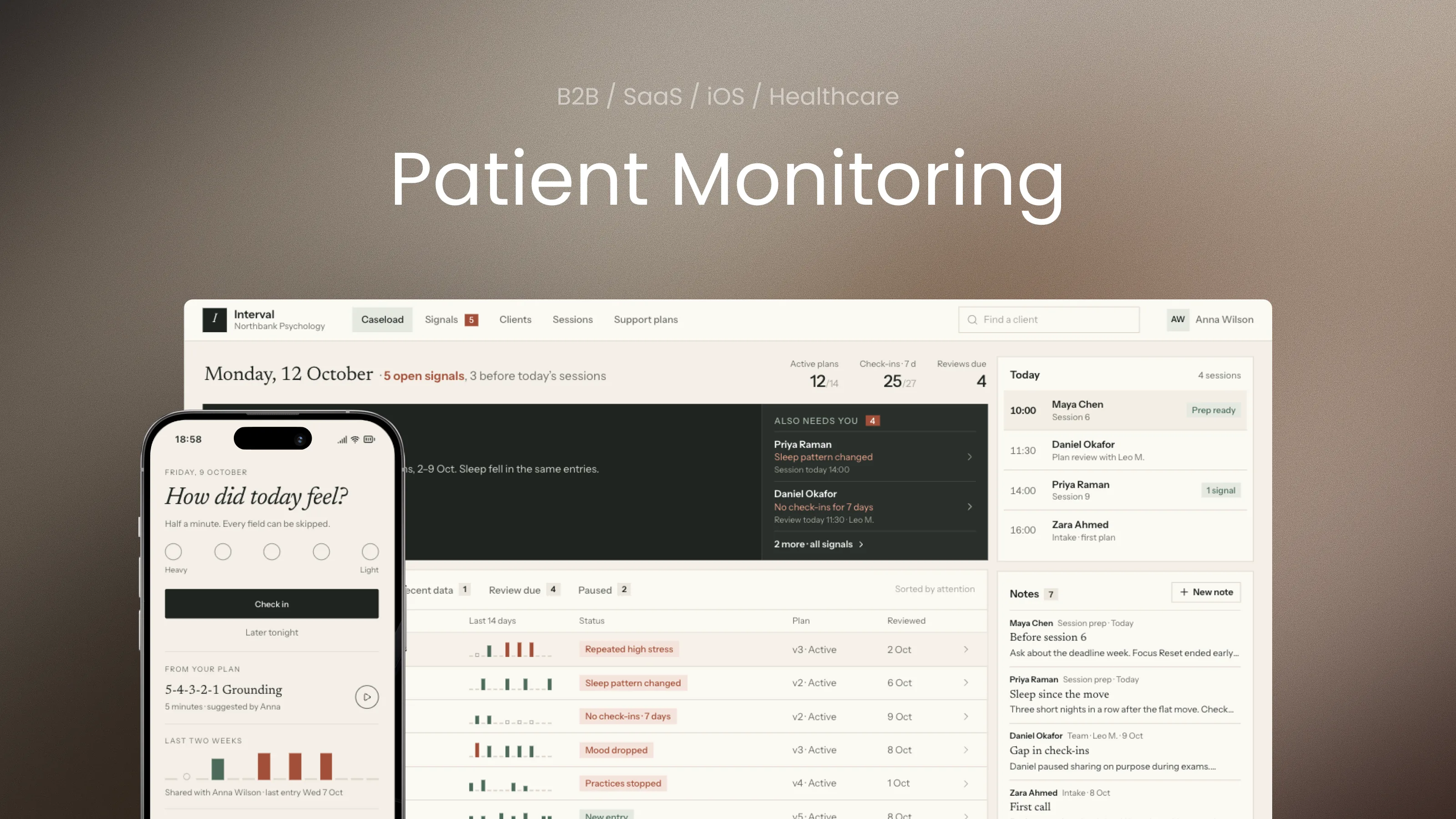
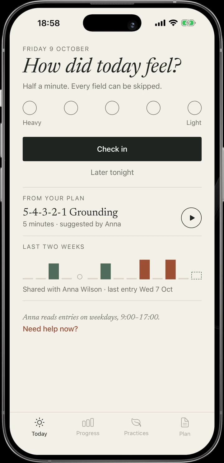
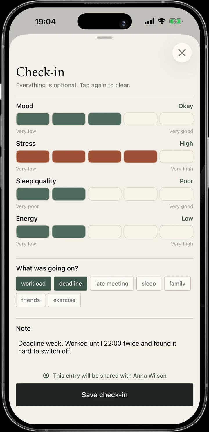
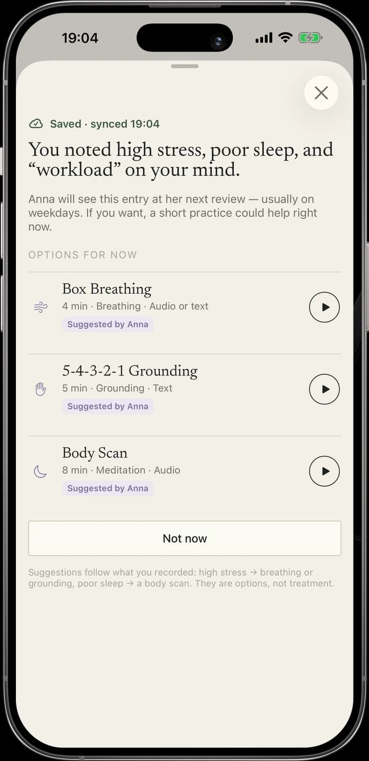
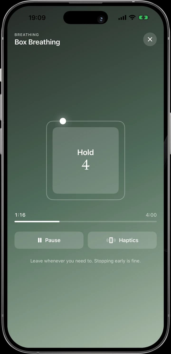
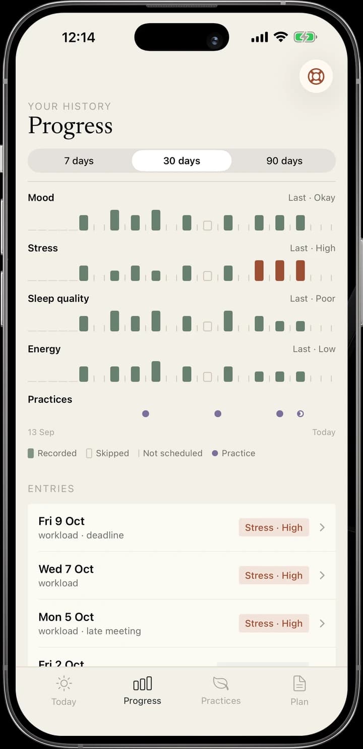
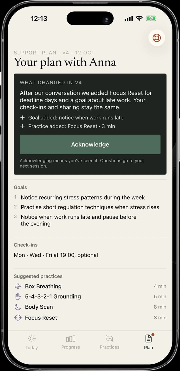
One token set serves the psychologist’s tool and the client’s iOS app, so a check-in, a practice or a plan change reads the same on both sides. The palette comes from the app: warm paper, ink for text and actions, sage for client data and terracotta only for what changed. People and words are set in Newsreader, the interface in Instrument Sans; the web keeps square corners, the app keeps its soft round controls.
Missing data is designed as carefully as data. A skipped check-in, an expected one and a private entry each have their own texture, so silence is never drawn as a low value.