
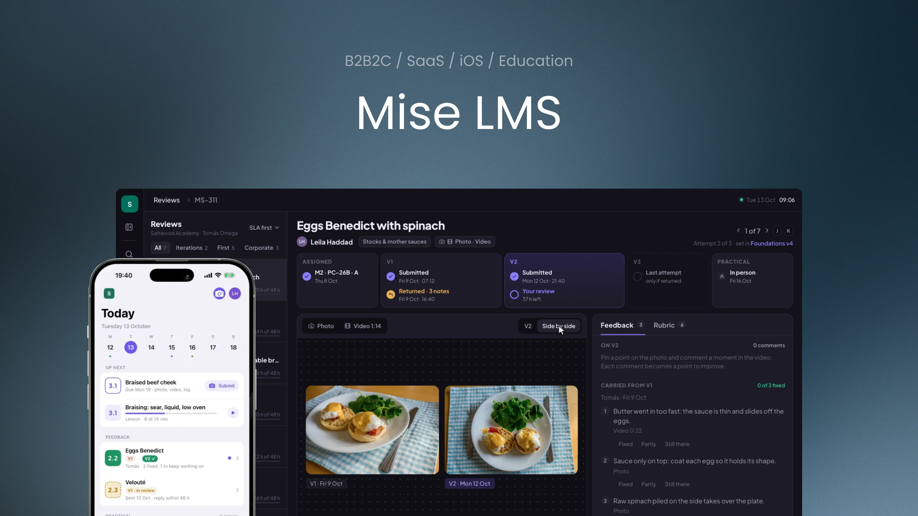

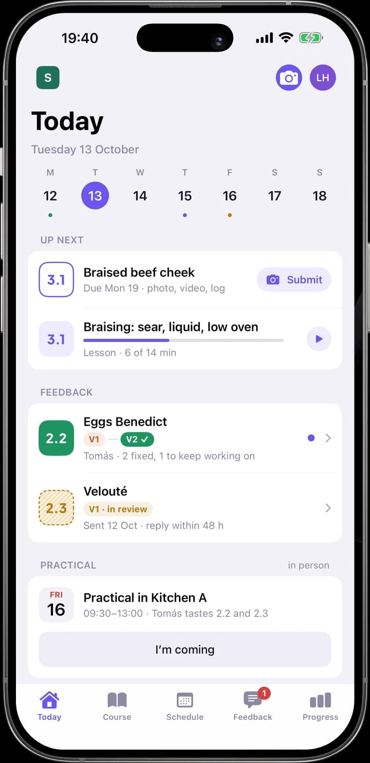
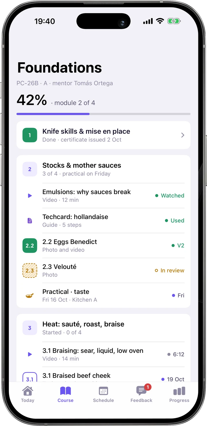
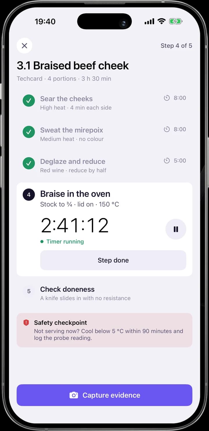
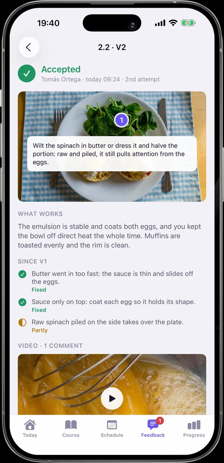
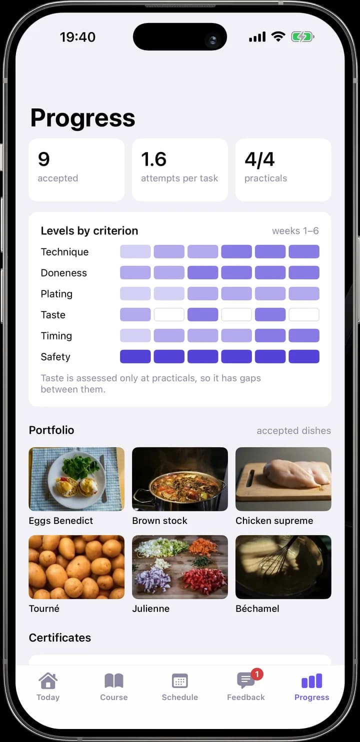
Theme follows the role. Mentors, curators and administrators spend whole days in the workspace looking at photos and videos of work, so it is a dark violet-graphite room where the students’ work is the brightest thing on screen. Students open the platform between tasks, often at a workstation in daylight, so their web view and iOS app are light.
Both themes resolve the same semantic roles: one violet for action and focus, green, amber and red for the state of work. The structure is the platform’s own, not the subject’s: rounds of attempts, pinned feedback, a rubric and evidence. Plus Jakarta Sans carries the English interface; the Ukrainian page switches the whole interface to Manrope, which has Cyrillic.